Long before the modern infographic appeared on a phone screen, a group of designers and educators in Vienna was asking a deceptively difficult question: how can complicated information be made understandable to people who do not share the same education, language or technical vocabulary?
Their answer was a system of pictures.
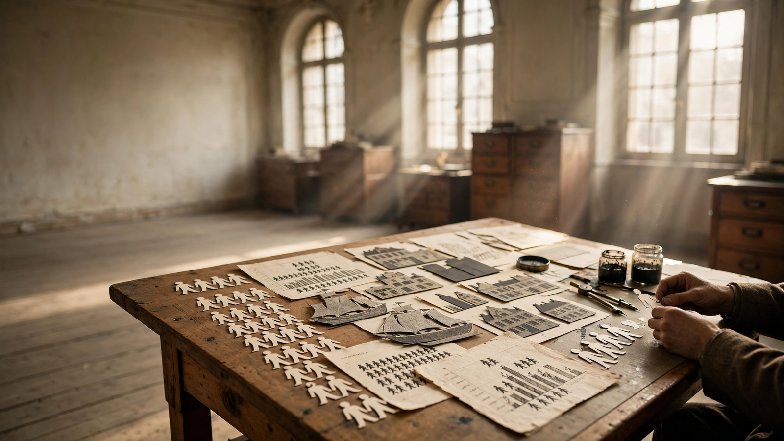
Known first as the Vienna Method of Pictorial Statistics and later as Isotype, the project turned statistics about housing, health, work, population and industry into carefully organized arrangements of repeated symbols. A small figure could represent 1 million people. A row of houses could show changes in living conditions. A sequence of icons could make the difference between rural and urban life visible at a glance.
Isotype was not simply an early form of decoration. It was a serious attempt to make public knowledge more democratic. Its posters and charts treated visual design as a civic tool: a way to help ordinary people understand the forces shaping their lives.
A museum built for social knowledge
The story began in Vienna after the First World War, when the city became an important center of reformist politics, public housing and adult education. In 1925, philosopher and social scientist Otto Neurath helped establish the Gesellschafts- und Wirtschaftsmuseum, or Museum of Society and Economy.
The museum did not operate like a traditional collection devoted to paintings or historical objects. Its purpose was to explain how society worked. It presented information about housing, wages, health, industry and population through exhibitions designed for a broad public.
Neurath believed that statistics should not remain locked inside government reports or academic publications. But he also understood that simply adding pictures to numbers would not solve the problem. A visual system needed rules. Symbols had to remain consistent. Scale had to be clear. Decorative perspective and unnecessary detail could distract from the underlying comparison.
That led the museum toward a disciplined graphic language. Instead of using one large figure to show a larger number, designers generally repeated a standard symbol. Ten small human figures meant ten units; a half-symbol could show a fraction. The method was designed to make quantities countable rather than merely impressive.
The people behind the pictures
Neurath was the public theorist and organizer, but Isotype was created by a team. Two collaborators were especially important: Marie Reidemeister and Gerd Arntz.
Reidemeister worked as what the project called a “transformer.” Her role was to take complicated verbal or statistical material and determine how it could be translated into a visual sequence. That required more than drawing ability. She had to decide what the information meant, which comparisons mattered and how much explanation viewers would need.
Arntz, an artist with a background in socially engaged graphic work, developed many of the bold, economical symbols associated with the system. His figures avoided individual expression and realistic detail. A worker, farmer, child or soldier became a simplified sign that could be repeated across a chart.
The division of labor was central to the method. Isotype did not imagine that one inspired artist would spontaneously produce a perfect image. It treated visual communication as a process of research, editing, drawing, checking and explanation.
That collaborative structure also challenged the familiar idea of the solitary designer. The final poster might look simple, but its simplicity was the result of decisions made by statisticians, educators, writers, artists and organizers.
Why repetition mattered
One of Isotype’s most recognizable ideas was the use of repeated symbols to represent quantities. A chart showing population might contain hundreds of identical figures arranged in rows. A chart showing industrial production might use repeated tools, machines or buildings.
This choice had an important practical consequence. It made comparisons visible without requiring the viewer to decode a complex scale. The eye could see that one group contained twice as many symbols as another. The picture became a structure for reasoning.
But Isotype was not based on the claim that pictures could replace words completely. Neurath and his colleagues recognized that symbols could be ambiguous. A human figure might represent people, workers, citizens or a unit of population depending on the chart. Titles, labels and explanatory text remained necessary.
The system was therefore better understood as a partnership between image and language. Pictures organized the information; words established what the symbols meant. This distinction remains useful today, when a colorful chart can appear easy to understand while hiding uncertain definitions or misleading comparisons.
Posters for a public audience
The Vienna museum used exhibitions, wall charts, books and posters to bring its method into public life. The subjects were often practical rather than abstract: housing conditions, infant mortality, employment, food, education and the distribution of resources.
These were not advertisements for consumer products. They were attempts to explain the structure of everyday life. A visitor could encounter a visual comparison of household conditions or see how a city’s population had changed over time. The materials aimed to provide social knowledge in a form that could be absorbed quickly in a busy exhibition space.
That made Isotype part of the history of ephemera as much as the history of graphic design. A poster is temporary by nature. It is made for a particular wall, campaign, exhibition or public need. Yet these temporary objects can preserve the assumptions of an era: what a society considered measurable, what it wanted citizens to know and which groups it believed should be visible.
Isotype posters also demonstrated that public information did not have to look dull in order to be serious. Strong colors, flat shapes and rhythmic arrangements gave the charts an immediate visual identity. The work was accessible without being simplistic.
Exile and reinvention
The political conditions that had helped the Vienna project flourish eventually made its work impossible there. After the Austrian Civil War in 1934 and the authoritarian changes that followed, the Museum of Society and Economy was closed.
Neurath escaped to the Netherlands, where he continued the work with collaborators. After the German invasion of the Netherlands in 1940, he and Reidemeister fled again, eventually reaching Britain. In the United Kingdom, the work continued under the name Isotype Institute.
The change of name reflected more than a change of address. The project was no longer tied to one city’s reform culture. It became an international effort to develop visual explanations for education, public administration and social research.
In Britain, Isotype materials were used in books, exhibitions and educational projects. The designers worked with publishers and institutions to explain subjects ranging from public health to world geography. The method traveled because it was adaptable: a symbol system could be revised for different languages and audiences while retaining its basic principles of repetition, clarity and comparison.
From Isotype to the visual public sphere
It would be too simple to say that Isotype directly created every modern symbol system. Public signage, transportation symbols, statistical graphics and information design developed through many overlapping traditions and later practitioners. Still, Isotype helped establish an influential way of thinking about visual information.
Its legacy can be seen in the belief that a chart should have a clear argument, that symbols should be economical and that the design of information affects who can use it. Modern museum graphics, public-health diagrams, election maps and data journalism all wrestle with problems that Neurath’s team confronted nearly a century ago.
There is also a philosophical legacy. Isotype assumed that information design carried social responsibilities. A chart could illuminate inequality or conceal it. A symbol could make a population visible or reduce people to an abstract count. The choice of scale, color, category and emphasis was never entirely neutral.
That is why the work remains relevant in an age of dashboards and viral graphics. The technology has changed, but the central question has not: does a visual explanation help people understand, or does it merely make information look convincing?
The unfinished promise of visual literacy
Isotype did not create a universal language in the literal sense. Its symbols still required context, translation and interpretation. Nor could a poster eliminate the political disagreements behind the numbers it displayed.
What it offered was more practical and more durable: a method for making public evidence visible.
The best Isotype work respected its audience. It did not assume that ordinary viewers were incapable of understanding statistics. It assumed instead that statistics should be designed with ordinary viewers in mind.
That principle gives these posters their continuing force. Their figures may look quiet and geometric, but they embody an ambitious democratic idea: knowledge becomes more useful when more people can see how it is organized.
Use: Background on Otto Neurath, Marie Reidemeister, Gerd Arntz, the Vienna Method and the development of Isotype.
Use: Research context on Isotype’s visual language, archives and design history.
Use: Museum context on Isotype, pictorial statistics and its influence on information design.
Use: Biographical and historical background on Neurath and the Vienna intellectual environment.
Isotype Revisited — https://www.isotyperevisited.org/ — Background on Otto Neurath, Marie Reidemeister, Gerd Arntz, the Vienna Method and the development of Isotype.
University of Reading, Isotype research — https://www.reading.ac.uk/design-innovation/research/isotype — Research context on Isotype’s visual language, archives and design history.
Victoria and Albert Museum, Isotype resources — https://www.vam.ac.uk/articles/isotype — Museum context on Isotype, pictorial statistics and its influence on information design.
Encyclopaedia Britannica, Otto Neurath — https://www.britannica.com/biography/Otto-Neurath — Biographical and historical background on Neurath and the Vienna intellectual environment.