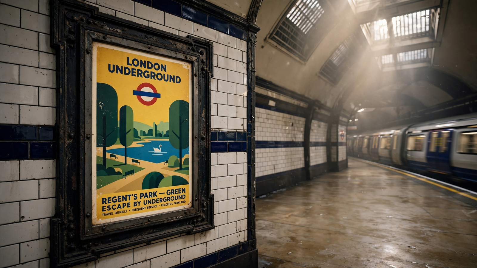
Before a journey could be planned on a phone, it might begin with a poster beneath the streets of London. For related reading, see Dig for Victory: How a Wartime Poster Turned Backyards Into Food Policy.
A commuter waiting for a train could look up and see a sharply angled landscape, a simplified animal, a theatrical view of a park or a burst of color suggesting the pleasures of a day away from home. The message was often brief. The design did most of the work. For related reading, see Luxembourg Made Everyday Travel Free—and Turned a Commute Into a Public Service.
During the 20th century, London’s Underground became one of the most influential patrons of public graphic design. Its posters did not simply announce fares, routes or timetables. They sold the idea of London as a place of possibility—and encouraged Londoners to use the railway to discover it. For related reading, see Poetry in Motion: How New York’s Subway Turned Daily Travel Into a Public Reading Room.
A railway learned to speak visually
London’s Underground railway companies were competing for passengers in a city already crowded with buses, trams, suburban railways and private cars. Promoting the system meant more than explaining where trains went. It meant giving people a reason to board them.
That challenge helped produce a distinctive visual language. The Underground’s familiar roundel, introduced in the early 20th century, gave the network a recognizable public identity. Later, the Johnston typeface, commissioned in 1916 from the calligrapher Edward Johnston, made station names and railway information feel part of the same system.
Posters extended that identity beyond signs and platforms. They could be placed in stations, on street-level hoardings and in other public locations. Their subjects ranged from museums and theaters to parks, historic buildings, sporting events and the countryside beyond London.
The railway was not treating art as decoration added after the serious business was complete. It was using design as part of its operating strategy. A good poster could spread demand across the network, draw passengers at quieter times and present the Underground as a modern service connected to the whole life of the city.
Frank Pick and the idea of a designed railway
The person most closely associated with this transformation was Frank Pick, an administrator who rose through London’s Underground companies and became managing director of the newly organized London Passenger Transport Board in 1933.
Pick believed that every public encounter with the railway mattered. Stations, signs, maps, vehicles, publicity and printed material should not look like unrelated parts of different businesses. They should work together.
That approach helped create an unusually ambitious relationship between a transport authority and artists. Instead of relying only on conventional commercial advertising, the Underground commissioned designers who were willing to simplify, exaggerate and experiment. The results were practical advertisements, but they also became small-scale exhibitions distributed across the capital.
The system’s artistic policy was especially striking because it met people where they already were. A museum visitor might seek out a gallery, but a traveler did not need to enter an art institution to encounter a modernist composition. The station wall became a place where abstract shapes, unusual perspectives and strong color could enter ordinary life.
Edward McKnight Kauffer changed the scale of the message
Among the most important artists to work for the Underground was Edward McKnight Kauffer, an American-born designer who spent much of his career in Britain. His posters drew on Cubism, Futurism and other modernist ideas, but they were designed to work quickly and at a distance.
Kauffer understood that a poster in a busy station could not depend on fine detail. It needed a commanding silhouette, a memorable arrangement and a clear emotional effect. A landscape might be reduced to rhythmic bands of color. A vehicle could become a pattern of speed. A destination could be suggested rather than fully illustrated.
That compression was part of the medium’s power. The poster did not offer a complete travel guide. It created a mental opening through which the viewer could imagine a different afternoon, a different neighborhood or a different kind of weather.
Kauffer’s work also demonstrated that modern art did not have to remain inside galleries. New visual ideas could function in a commercial setting without becoming visually timid. The Underground’s publicity department gave designers a public audience far larger than the visitors to a specialist exhibition.
A city advertised through its destinations
Many Underground posters promoted places that were already part of London’s cultural geography: Kew Gardens, the Zoo, the museums of South Kensington, sporting grounds, river excursions and historic sites. Others promoted green spaces at the city’s edge or destinations reached by extensions of the network.
This was more than a list of attractions. Together, the posters proposed a map of leisure. London was presented as a collection of experiences linked by public transport. The Underground could take a passenger from a crowded central street to trees, water, architecture or open air without requiring a private vehicle.
The approach also helped change how Londoners imagined the city. A neighborhood was not only where people lived or worked. It could be a place to visit. A train line was not simply infrastructure. It was an invitation to move through different versions of urban life.
The designs often made that invitation feel optimistic. In the interwar period, when public life was marked by economic uncertainty and the memory of war, a poster showing an accessible escape offered a modest but tangible promise: there was somewhere else to go, and the railway could help get you there.
Modernism became part of the commute
The Underground was not the only organization to commission ambitious posters, but its program became unusually coherent. Artists including Paul Nash, Graham Sutherland, Laura Knight, Edward Bawden and Abram Games contributed to the broader history of London Transport publicity. Each brought a different visual language to the same practical problem: how to make a place or service visible in a few seconds.
The variety mattered. Some posters favored bold geometry; others used landscape painting, illustration, lettering or humor. The network’s identity did not require every artist to work in the same style. The shared framework was the purpose, the format and the confidence that public advertising could reward attention.
That confidence helped make the posters influential beyond transport. They became examples for commercial designers, collectors and later generations of graphic artists. They also offered a model for public institutions that wanted to communicate without making every message look bureaucratic.
In the best examples, information and imagination remain balanced. The viewer understands that a destination is reachable, but the poster does not stop at a map reference. It turns a practical fact into a desire.
Preserving a paper record of public life
Most posters were made to be pasted up, exposed to weather, covered by newer announcements and eventually discarded. Their survival is therefore part of the story. The London Transport Museum has preserved a major collection of Underground and London Transport posters, along with artwork, printed ephemera and related design material.
Seen together, these objects reveal how much a transport system once communicated through paper. They record changing ideas about leisure, technology, landscape, class, fashion and the meaning of a modern city. They also show which destinations institutions wanted the public to notice—and which audiences they imagined would respond.
A poster is never a neutral window. It selects a mood and leaves other realities outside the frame. The cheerful countryside image may say little about who could afford a day trip. The glamorous view of a cultural destination may simplify the people and histories attached to it. Looking at the collection today means appreciating the artistry while also reading the assumptions built into the invitation.
That double perspective is one reason the posters remain valuable. They are both designed objects and social documents. Their colors and shapes attract the eye, while their subjects preserve a record of what a major public service believed could bring people together.
The enduring lesson of the Underground poster
London’s Underground posters belong to an era of printed communication, but their central idea remains current. Public systems are experienced not only through their physical function but also through the stories they tell about where that function can lead.
A train network can be described in engineering terms: tracks, tunnels, signals, platforms and schedules. The poster added another layer. It made mobility emotional. It suggested that the city was larger than the part immediately outside the station and that movement through it could be a form of discovery.
That is why the posters have outlived many of the campaigns they once supported. Their original destinations may have changed, and their paper may now be held behind museum glass, but the underlying invitation still feels clear. Look up. Take the train. There is more of the city to see.
Use: Collection context, London Transport poster history, artists and preserved examples.
Use: The Underground’s wider visual-identity program and design holdings.
Use: Historical and design context for the Underground’s poster commissions.
Use: Background on Kauffer’s career and modernist graphic work.
Use: Context for the relationship between London Transport, graphic design and public life.
London Transport Museum — Posters and poster collection — https://www.ltmuseum.co.uk/collections/collections-online/posters — Collection context, London Transport poster history, artists and preserved examples.
London Transport Museum — Art and design collections — https://www.ltmuseum.co.uk/collections/collections-online/art-design — The Underground’s wider visual-identity program and design holdings.
Victoria and Albert Museum — London Underground posters — https://www.vam.ac.uk/articles/london-underground-posters — Historical and design context for the Underground’s poster commissions.
Tate — E. McKnight Kauffer — https://www.tate.org.uk/art/artists/e-mcknight-kauffer-1391 — Background on Kauffer’s career and modernist graphic work.
Design Museum — London Transport design — https://designmuseum.org/exhibitions/permanent/london-transport — Context for the relationship between London Transport, graphic design and public life.