Before the automobile became an everyday possession, a tire was not an especially easy thing to explain. It was a ring of rubber, vulnerable to punctures and wear, attached to a machine that many people still regarded with suspicion. Michelin, the French tire company founded by brothers André and Édouard Michelin, found a memorable way to make the technology familiar: it gave the tire a body, a face, and a name.
The result was Bibendum, better known around the world as the Michelin Man. Built from a stack of pale tires, the character began as a flamboyant figure in an 1898 advertising poster. More than a century later, he remains one of the most recognizable figures in commercial art.
A character hiding in a pile of tires
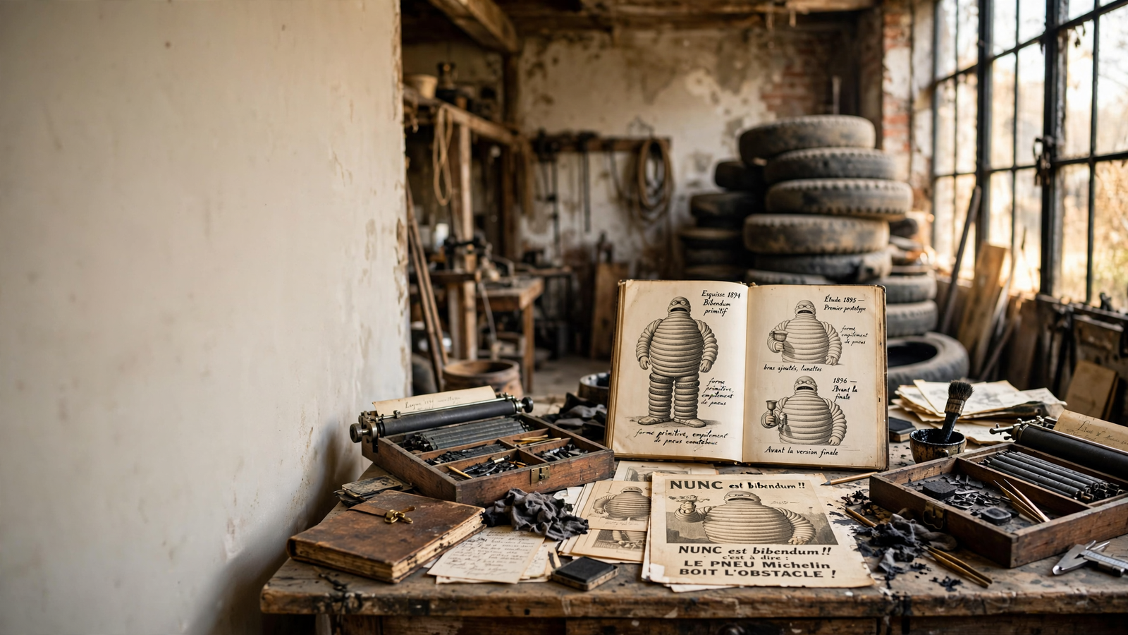
The story began at the 1894 Universal and Colonial Exhibition in Lyon, where Édouard Michelin reportedly noticed a stack of tires and remarked that, with arms, it might look like a man. The idea stayed with him. A few years later, the company worked with French poster artist Marius Rossillon, known professionally as O’Galop, to turn that observation into an advertisement.
O’Galop adapted an earlier concept that showed a large, cheerful figure raising a glass. In the Michelin version, the figure was made from tires. He stood at a table, dressed in the formal style associated with a prosperous gentleman, and toasted the dangers of the road. The poster’s Latin phrase, “Nunc est bibendum,” came from the Roman poet Horace and means, roughly, “Now is the time to drink.”
The visual joke depended on a second line of text: Bibendum’s glass was filled not with wine, but with broken glass, nails, and other hazards. The character was declaring that Michelin tires could consume the obstacles that threatened early motorists.
That first Bibendum was not the simple mascot familiar today. He wore spectacles, smoked a cigar, and carried himself like a wealthy traveler. His body was made of individual tire rings, making the product itself the source of his anatomy. The advertisement did not merely place a logo beside a tire. It transformed the tire into a character who could speak for the company.
Why the idea worked
Advertising in the late 19th century often relied on large posters, bold colors, theatrical gestures, and instantly legible symbols. This was especially useful for an industry still trying to teach the public what its products did.
Michelin made bicycle tires before it became famous for automobile tires, and the company’s early business developed during a period when cycling and motoring were changing ideas about distance. A tire was a technical object, but the promise surrounding it was emotional: a better tire could mean a longer ride, fewer interruptions, and greater confidence away from home.
Bibendum gave that promise a human shape. He could appear in a newspaper, on a roadside sign, in a catalog, or on a garage wall without needing a long explanation. His unusual body also made the product unmistakable. A viewer who saw the white, segmented figure could understand the connection to tires even before reading the company name.
The character’s name helped, too. “Bibendum” was less a personal name than a memorable piece of language attached to the original toast. Over time, people in different countries developed their own informal names for him, while Michelin continued to use the character as a global sign of the brand.
From elegant gentleman to road companion
Bibendum changed as the automobile changed. In early advertisements, he could look aristocratic, athletic, mischievous, or imposing. His form was sometimes thin and carefully segmented, reflecting the appearance of the tires from which he was assembled. Later versions became rounder and more approachable.
Those changes were not accidental. Advertising characters have to reflect the audience a company wants to reach. The first Bibendum belonged to an era of elaborate clothes, mechanical novelty, and motoring as a pastime for people with money. As cars spread more widely, the character moved closer to ordinary drivers and everyday travel.
He appeared in scenes involving road trips, maps, workshops, races, and breakdowns. At times he acted as a guardian of the road; at others, he was simply a cheerful traveler. His job was to make an industrial company feel present in the driver’s world.
That evolution also softened some of the early character’s more dated imagery. The original advertising language reflected the social assumptions of Belle Époque Europe, including class signals and the grand, theatrical style common to commercial posters of the period. Later versions generally emphasized movement, friendliness, and product recognition rather than the cigar-smoking gentleman of the first campaigns.
The white figure in a colorful advertising age
Bibendum’s appearance is often described as white, but the character’s color had a practical history. Early Michelin tires were made with natural rubber and were not necessarily the deep black associated with modern tires. Carbon black was added to rubber compounds in the early 20th century, improving durability and resistance to ultraviolet light while also making tires black.
As tires darkened, the pale figure became even more distinctive. His color separated him from the product without breaking the visual connection. In a crowded poster or a busy street scene, a white figure made of tire rings could be recognized at a glance.
The design also gave artists room to show movement. Bibendum could bend, wave, race, salute, or lean forward. His body was solid enough to feel dependable but flexible enough to act like a person. That balance helped him survive changes in illustration, printing, photography, and television.
More than a logo
Michelin used Bibendum to sell more than individual tires. The company also published maps and travel guides, helping drivers imagine where a reliable automobile might take them. The famous Michelin Guide began in 1900 as a publication intended to encourage motorists to travel, and its restaurant ratings later became an institution of their own.
The mascot and the guide served related purposes. One made the tire memorable; the other helped create a culture of motoring around it. Together, they suggested that roads were not simply engineering infrastructure. They were routes toward discovery, meals, landscapes, and experiences.
That is one reason Bibendum belongs in the history of Americana even though his origins are French. He became part of a worldwide visual language of modern travel. In the United States, where highways, service stations, roadside restaurants, and family road trips reshaped daily life during the 20th century, the Michelin Man fit naturally into the expanding culture of the automobile.
A mascot that learned to age
Many advertising characters are tied tightly to a particular moment. Their costumes, slogans, or mannerisms eventually become dated. Bibendum has lasted because the basic idea is unusually adaptable. A body made from tires can be redrawn for a poster, simplified for a sign, animated for television, or rendered digitally without losing its identity.
Michelin has periodically redesigned the character. His body has become smoother, his expression more welcoming, and his gestures more restrained. Yet the essential features remain: the pale tire rings, the rounded form, and the sense that he is built from the product rather than merely standing beside it.
In recent decades, the company has also used the character in messages about road safety, mobility, and technological development. Those subjects require a different tone from the comic spectacle of the 1898 poster. The mascot’s continued usefulness lies in his ability to move between those roles while remaining recognizable.
What Bibendum made visible
The Michelin Man is sometimes treated as a charming relic of vintage advertising, but his deeper importance is that he solved a persistent problem in commercial communication: how to make an invisible promise visible.
A tire’s value is partly preventative. When it works, nothing dramatic happens. The vehicle moves, stops, turns, and continues. The customer is buying confidence in a component that is easy to overlook until it fails.
Bibendum turned that quiet promise into a person. He could confront nails and broken glass, travel roads, inspect vehicles, and accompany motorists into the future. The character did not explain every detail of tire construction. Instead, he made reliability feel like a companionable presence.
That may be why he has remained so durable while countless slogans and campaigns have disappeared. The Michelin Man began as a clever drawing in an age of posters and mechanical wonder. He endured because the drawing contained a complete idea: technology could be useful, travel could be inviting, and even a stack of tires could become part of a shared cultural memory.